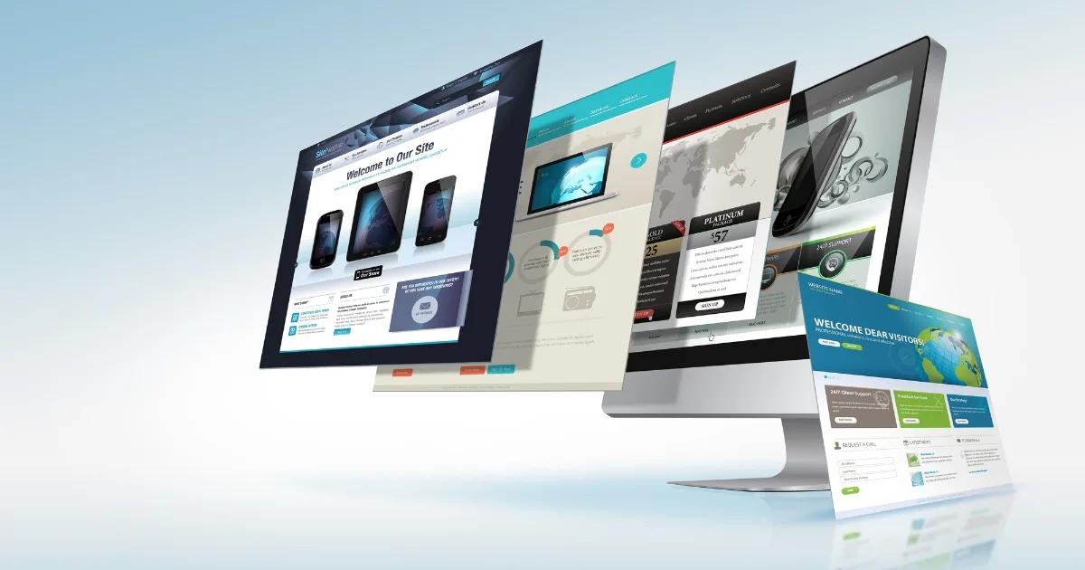
Website navigation design plays a crucial role in creating a seamless user experience and guiding visitors through a website’s content. Effective navigation ensures that users can easily find the information they need, leading to increased engagement, longer visit durations, and improved conversion rates.
In this article, we will explore the dos and don’ts of website navigation, offering valuable insights and practical tips to help designers and developers create intuitive and user-friendly navigation systems. By following these guidelines, you can enhance the usability of your website, enhance user satisfaction, and ultimately achieve your website’s goals.

The dos of website navigation
When it comes to designing an effective website navigation system, there are several key principles to keep in mind. From clear and intuitive labelling to maintaining consistency across pages, each ‘do’ focuses on enhancing the user experience and guiding visitors effortlessly through your website’s content.
Clear and intuitive labelling
One of the fundamental aspects of effective website navigation is using clear and intuitive labels for menu items. Ensure that the text used for navigation labels is descriptive and concise, providing a clear understanding of what users can expect when they click on a particular link. Avoid using jargon or industry-specific terms that may confuse visitors. By using language that is familiar and easily understandable, you can enhance the usability of your navigation and help users navigate your website with ease.
Consistency across pages
Consistency is key when it comes to website navigation design. Users rely on consistency to navigate a website smoothly and efficiently. Maintain a consistent navigation structure throughout all pages of your website, ensuring that the placement, order, and styling of your navigation elements remain the same. This helps users develop mental models of your website’s structure and enables them to find what they are looking for quickly, regardless of the page they are on.
Prioritise main navigation items
Not all sections or pages on your website hold equal importance. To guide users effectively, it is crucial to prioritise main navigation items. Highlight key sections or pages that are essential for users to access. This can be achieved through various visual cues such as colour, typography, or size. By emphasising important navigation elements, you draw attention to them and make it easier for users to navigate to the most critical areas of your website.
Implement responsive design
With the increasing use of mobile devices, it is vital to design navigation menus that are responsive and adaptable to different screen sizes. Create mobile-friendly navigation menus that are easy to use on small touchscreens. Consider touch-friendly elements such as larger buttons or menus that expand with a single tap. By ensuring your website’s navigation is optimised for different devices, you provide a seamless experience for users across desktops, tablets, and smartphones.

The don’ts of website navigation
While knowing what to do is essential in website navigation design, it’s equally crucial to be aware of what not to do. By understanding pitfalls and avoiding them, you can create a smoother and more intuitive user experience. From avoiding cluttered navigation menus to steering clear of ambiguous labels, each don’t provides a valuable insight on what to avoid when designing your website’s navigation.
Avoid cluttered navigation menus
Cluttered navigation menus can overwhelm users and make it difficult for them to find what they’re looking for. When designing your website’s navigation, it’s important to limit the number of menu items and prioritise the most important sections or pages. Overloading the menu with too many items can lead to confusion and hinder the user experience. Instead, focus on providing a streamlined and concise navigation menu that guides users effectively.
Steer clear of ambiguous or vague labels
Navigation labels should accurately represent the content of the linked pages. Using ambiguous or vague labels can confuse users and make it challenging for them to navigate your website. It’s crucial to use language that is precise, clear, and easily understandable. Take the time to carefully choose descriptive labels that accurately reflect the purpose of each navigation item. Testing labels with user feedback or conducting usability testing can help ensure that the labels are intuitive and meaningful to users.
Don’t rely solely on dropdown menus
While dropdown menus can be useful for organising content, it’s important not to rely solely on them as the primary method of navigation. Users may have difficulty accessing dropdown menus, especially on mobile devices or for those with motor impairments. It’s essential to consider alternative navigation options such as sidebar menus, hamburger menus, or footer menus to provide users with multiple ways to access your website’s content. By offering diverse navigation methods, you enhance accessibility and usability for a wider range of users.
Avoid complex or unconventional navigation patterns
While it can be tempting to experiment with unique and unconventional navigation patterns, it’s crucial to prioritise user familiarity and minimise cognitive load. Users are accustomed to certain navigation patterns and expect consistency across websites. Straying too far from familiar design patterns can confuse and frustrate users. Stick to standard design conventions and keep navigation intuitive and easy to understand. By providing a seamless and familiar navigation experience, you enable users to navigate your website with confidence.
Best practices for website navigation design
Incorporating these best practices into your website navigation design can greatly improve its usability and user experience. By conducting user research, optimising for search engines, and providing clear feedback and visual cues, you create a navigation system that is intuitive, user-friendly, and guides visitors smoothly through your website’s content.
Conduct user research and testing
To create an optimal website navigation design, it’s essential to understand the preferences and behaviour of your target users. Conduct user research and gather insights on how users navigate similar websites or platforms. This can involve user interviews, surveys, or analysing user behaviour through analytics tools. Conduct usability testing to observe how users interact with your navigation system and gather feedback on its effectiveness. By incorporating user feedback and insights into your design process, you can create a navigation structure that aligns with user expectations and enhances their overall experience.
Optimise for search engines
An effective website navigation design not only benefits users but also search engine optimisation (SEO). Ensure that your navigation system is search engine-friendly by incorporating relevant keywords in navigation labels. This helps search engines understand the content and structure of your website, improving its visibility in search results. Ensure that your navigation is crawlable by search engines, allowing them to index your website’s pages effectively. By optimising your navigation for search engines, you enhance the discoverability and visibility of your website.
Provide clear feedback and visual cues
Clear feedback and visual cues help users understand their current location within your website and navigate with confidence. Use hover effects, highlight active menu items, or employ breadcrumbs to indicate the user’s position. These visual cues provide a sense of orientation and improve the overall usability of your navigation system. Provide feedback when users interact with navigation elements, such as showing loading indicators or highlighting selected options. By offering clear feedback and visual cues, you reduce user confusion and enhance the user experience.

Do the right thing when it comes to your website’s navigation
The dos and don’ts of website navigation design play a critical role in creating a seamless and user-friendly browsing experience. By following the best practices discussed in this article, you can ensure that your website’s navigation system is intuitive, clear, and effective in guiding visitors to the desired information. Incorporating clear and intuitive labelling, maintaining consistency across pages, prioritising main navigation items, implementing responsive design, and avoiding common pitfalls such as cluttered menus or ambiguous labels are key steps towards optimising your website’s navigation.
At JezNorthWeb, we understand the importance of effective website navigation design in delivering exceptional user experiences. Our team of experienced designers and developers can help you create a navigation system that aligns with industry best practices and meets the unique needs of your website. Contact us today to discuss how we can assist you in designing an intuitive and user-friendly navigation system that enhances your website’s usability and drives engagement.
Remember, the navigation design of your website has a significant impact on user satisfaction, engagement, and conversion rates. By implementing the dos and avoiding the don’ts of website navigation design, you can create a positive browsing experience that keeps visitors coming back for more. Invest in thoughtful navigation design, and watch as your website becomes a user-friendly destination that users love to explore.