
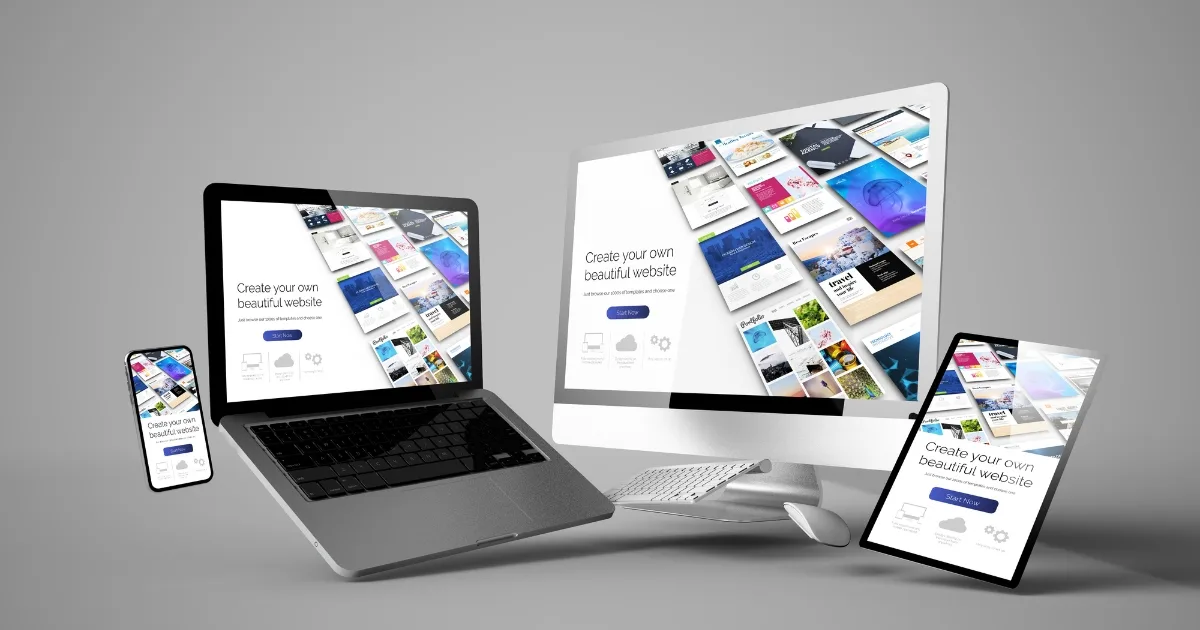
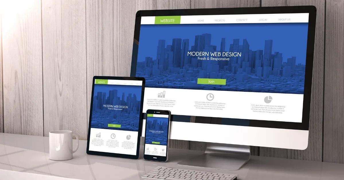
Over the course of the last few years, responsive website design has come to dominate the industry, significantly changing the process by which companies build their online presence. A responsive website is one that, regardless of the device being used to view it, can adapt to the screen being used.
A automatically reformats itself to provide the user with an improved experience that is tailored to the device they are using. It has the potential to offer many benefits to your website while still complying with Google’s recommendations. Users viewing your material on mobile devices will have an easier time doing so, for example, it stops photos from being wider than the screen they are viewing it on.

Cost effectiveness
It wasn’t all that long ago that companies typically developed two distinct iterations of the same website. One specifically geared for desktop users, and the other solely towards mobile users.
Today, many people continue to do this. However, having two distinct versions of a same website is a time-consuming and high-maintenance approach, which is especially relevant given the ever-increasing traffic coming from mobile users.
These days, you don’t need multiple websites, you only need to have one responsive one that’s optimised for all devices.
This ensures that consumers continue to view your content on their mobile devices. In addition to this, they may make a mental note to return to your website later whenever they are in need of the services that you provide.
It’s better for your users
The satisfaction of your users is of utmost importance to website proprietors. You want visitors to enjoy using your website, and you also want it to be straightforward in its navigation so that they will return. If someone accesses your website from a mobile device and it takes an inordinately long time to load, or if the images on your website do not have the appropriate resolution, this can give the impression that your firm is not professional.
Nobody is interested in conducting business with a location that lacks professionalism. But a responsive design, which provides a significantly better user experience, can help customers come around to the idea of giving your organisation a shot. The material may be viewed more quickly, and
the overall impression that is left with visitors will be significantly more favourable as a result of the elimination of the need to zoom in and scroll.
Further improving your SEO
Your websites will become more visible in search engines like Google, Yahoo, and Bing, with the help of responsive web design, which helps businesses enhance their search engine visibility. This is because responsive web design renders your website mobile-friendly, making it easier for consumers to view content and navigate the site. Google highly encourages using a responsive web design and gives websites that use it an edge by ranking them higher in the search results. It is common knowledge that Google wants the best for its consumers, and responsive site design is an excellent approach to go towards achieving that aim. Google can save time thanks to responsive web design because it crawls fewer pages overall. As a result of this boost in crawling efficiency, Google will be able to crawl your website, both more quickly and more frequently.

Better conversion, lower bounce
The implementation of a website with a responsive web design leads to decreased bounce rates and increased conversion rates. The percentage of visitors to your website that only view the homepage before leaving without clicking through to any other pages is referred to as the “bounce rate,” and it is one of the metrics that can be analysed using the term “bounce rates.” The responsive layout provides an enhanced user experience, which will lead to increased time spent on the site by visitors. A responsive website places an emphasis on the look, the feel, and the design of your site in order to encourage users to spend more time on your website while providing them with an enjoyable experience overall. If your website has a low bounce rate, this will lead to enhanced discussions, which indicates that people are returning to your site and spending more time there, both of which will help your website rank higher. A website that is responsive will have its layout fluidly adjusted so that it fits into the user’s device. This indicates that mobile users of flexible websites can receive improved levels of client engagement and higher conversion rates.
Ease of management
The majority of companies, and notably the smaller ones, don’t have a lot of time to spend updating or revamping the appearance of their website. With responsive web design, though, you won’t need to pay a designer to manage each and every component of your website because you’ll be able to make the modifications yourself in a way that’s both speedy and straightforward.
In addition, having just one website will make it much simpler for you to manage the many components of your marketing strategy. You won’t ever have to question whether or not all of your
redirect links will be working to get the appropriate visitors to the appropriate site, and you won’t ever have to worry whether or not you should link the mobile site or the desktop site on a social media update. The management of a website for a company is significantly less stressful when it is responsive.
Can your business benefit from a responsive web design from JezNorthWeb?
If the examples of responsive website design having a positive impact on businesses are not enough to sway your decision, perhaps the money and time savings will. The use of responsive design is an essential part of any successful modern online strategy, and you ought to incorporate it into your own plan as well. Get in touch with JezNorthWeb right away to take benefit of the most recent WRD innovation. You can reach us by calling 1300 024 766 or by using the contact form on this page.