
Website Design
Introduction
Design is an integral part of our lives, whether we realise it or not. From the clothes we wear to the websites we visit; design is all around us. One of the most important aspects of design is the use of colour. Colour palettes can have a significant impact on the success of a design, from attracting attention to conveying meaning and emotion.
Colour palettes are a fundamental element of any design. A colour palette is a range of colours that are used in a design or artwork. The use of colour palettes is not only limited to the visual arts; it can also be seen in product design, fashion, and architecture. In design, colour palettes are used to create a visual hierarchy, convey meaning, and elicit emotions.
The importance of colour palettes in design systems and style guides cannot be overstated. Design systems and style guides are essential tools for ensuring consistency in design across all platforms and products. A design system is a collection of reusable components, guidelines, and standards used to build products. A style guide is a set of rules and guidelines for the use of typography, colours, and other design elements.
Colour palettes play a crucial role in creating a cohesive design system and style guide. They provide a foundation for the visual language of a product or brand. The use of consistent colours across all products and platforms helps to establish a recognisable and memorable visual identity.
Understanding colour theory
Colour theory is the study of how colours interact with each other and with the human eye. Designers need to understand colour theory as it is the foundation for creating effective colour palettes. Colour theory is based on three primary colours: red, blue, and yellow. These colours cannot be created by mixing other colours. Secondary colours are created by mixing two primary colours. The secondary colours are green, orange, and purple. Tertiary colours are created by mixing a primary colour with a secondary colour. Tertiary colours are also called intermediate colours.
The colour theory also includes the concepts of hue, saturation, and value. Hue refers to the colour itself, such as blue or green. Saturation refers to the intensity or purity of the colour. A highly saturated colour is more vivid, while a desaturated colour is more muted. Value refers to the lightness or darkness of a colour.
Design systems
Design systems have become an essential tool for designers and developers looking to create consistent and efficient design solutions. A design system is a collection of reusable components, guidelines, and standards that are used to create a cohesive and scalable design language for a brand.
Different colour models
There are several different colour models used in the design, including RGB, CMYK, and Pantone. RGB stands for red, green, and blue, and is used for digital designs. CMYK stands for cyan, magenta, yellow, and black and is used for print designs. Pantone is a colour-matching system used for print designs.
Importance of understanding colour theory in design
Understanding colour theory is essential for creating effective colour palettes. By understanding the relationship between colours, designers can create harmonious and balanced colour schemes. They can also use colour to convey meaning and emotions. For example, blue is often associated with trust and stability, while red is associated with passion and excitement.
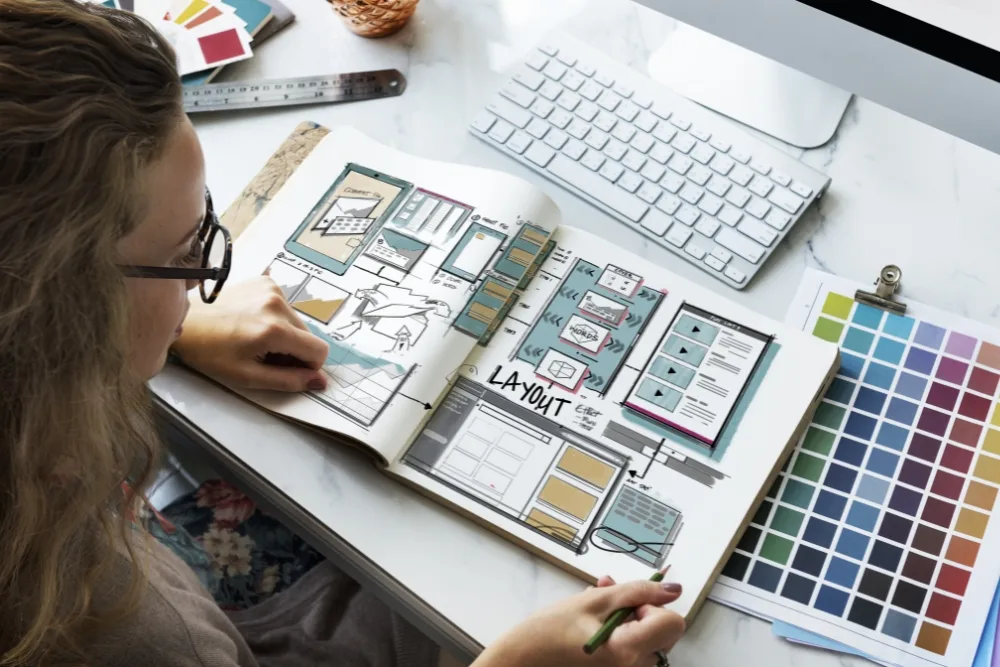
Understanding colour theory is important for accessibility. Colour blindness affects approximately 1 in 12 men and 1 in 200 women, making it crucial for designers to consider colour contrast when creating designs.
Choosing a colour palette
Choosing a colour palette is an important step in creating a cohesive and effective design. A well-designed colour palette can make a design stand out and effectively communicate the desired emotions and meanings.
Consider the brand identity
The brand identity should be a key consideration when choosing a colour palette. The colour palette should reflect the values and personality of the brand. For example, a brand that focuses on natural and organic products may choose a colour palette with earthy tones. A brand that wants to convey a sense of energy and excitement may choose a colour palette with bright and bold colours.
Use colour psychology
Colour psychology is the study of how colours affect human behaviour and emotions. Understanding the psychology of colour can help designers select colours that effectively communicate the desired emotions and meanings. For example, blue is often associated with trust and stability, while red is associated with passion and excitement.
Look to nature
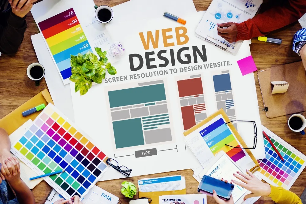
Nature can be a great source of inspiration for choosing a colour palette. The colours found in nature are often harmonious and balanced, making them an excellent starting point for creating a colour palette. For example, a colour palette inspired by the ocean may include shades of blue and green.
Use colour palette generators
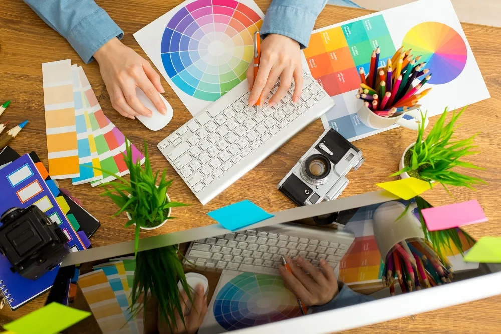
Colour palette generators are online tools that can help designers select a colour palette. These tools generate colour palettes based on a starting colour or a photograph. Designers can then refine the colour palette by adjusting the hue, saturation, and value of each colour.
Best practices for selecting colours
When selecting colours for a colour palette, it is important to consider the following best practices:
- Use a limited number of colours - Too many colours can make a design look cluttered and overwhelming.
- Create contrast - Contrast can help create visual interest and ensure that text and other design elements are easy to read.
- Consider accessibility - Designers should ensure that the colour palette is accessible to all users, including those with colour blindness.
- Test the colour palette - It is important to test the colour palette across different devices and platforms to ensure that the colours look consistent and effective.
Implementing colour palettes in design systems and style guides
Once a colour palette has been chosen, it is important to ensure that it is implemented consistently across all design assets. A design system and style guide can help ensure that the colour palette is used correctly and consistently.
The impact of colour palettes on user experience
Colour palettes can have a significant impact on the user experience of a product or website.
The future of colour palettes in design
As technology and design continue to evolve, the use of colour palettes in design is also evolving.
AI-generated colour palettes
Artificial intelligence (AI) is being used to generate colour palettes that are optimised for user engagement and accessibility. AI algorithms can analyse user behaviour and preferences, as well as design and brand guidelines, to generate colour palettes that are tailored to specific contexts and audiences. This can lead to more effective and personalised designs.
Colourless design
Some designers are experimenting with colourless or monochromatic designs, focusing instead on typography, layout, and other design elements. This approach can create a minimalist and sophisticated look and can be particularly effective for certain brands or products.

Interactive colour palettes
Interactive colour palettes allow users to change the colour scheme of a website or product to suit their preferences. This can create a more personalised and engaging experience for users and can help to differentiate products from competitors.
3D and augmented reality
As 3D and augmented reality (AR) technologies become more common in design, colour palettes are becoming more dynamic and immersive. For example, designers can create 3D environments with changing lighting conditions, or use AR to overlay digital content on the real world. These technologies offer new opportunities for colour palettes to create impactful and engaging experiences.
Sustainability
Designers are also considering the environmental impact of colour palettes. Choosing more sustainable materials and production methods, and designing for longevity and versatility, can help to reduce waste and promote sustainability.
The future of colour palettes in design is exciting and diverse. Emerging technologies and trends offer new opportunities for designers to create more personalised, engaging, and sustainable designs. As designers continue to experiment with new approaches to colour palettes, it is important to keep in mind the impact that colour has on user experience, behaviour, and perception, and to create designs that are accessible and inclusive for all users.
Let’s bring your brand to life with colour!
Are you looking to revamp your brand’s visual identity and create a design system that truly represents your company’s values and mission? Look no further than JezNorthWeb! Our team of experienced designers can help you choose the perfect colour palette, typography, and design elements that will bring your brand to life and make it stand out in a crowded market.
Contact us today to schedule a consultation and start your design journey. Together, we can create a design system that is both visually stunning and effective in communicating your brand’s message to your target audience. Don’t wait, let’s bring your brand to life with colour!