
Website Design

In today’s digital age, creating an accessible website that caters to all devices is more important than ever. As internet usage continues to grow and more people rely on mobile devices to access the web, businesses and organisations must ensure that their website is optimised for all devices. Responsive web design has emerged as a popular solution to this problem, enabling websites to adapt and display content seamlessly on any screen size.
Understanding Responsive Web Design
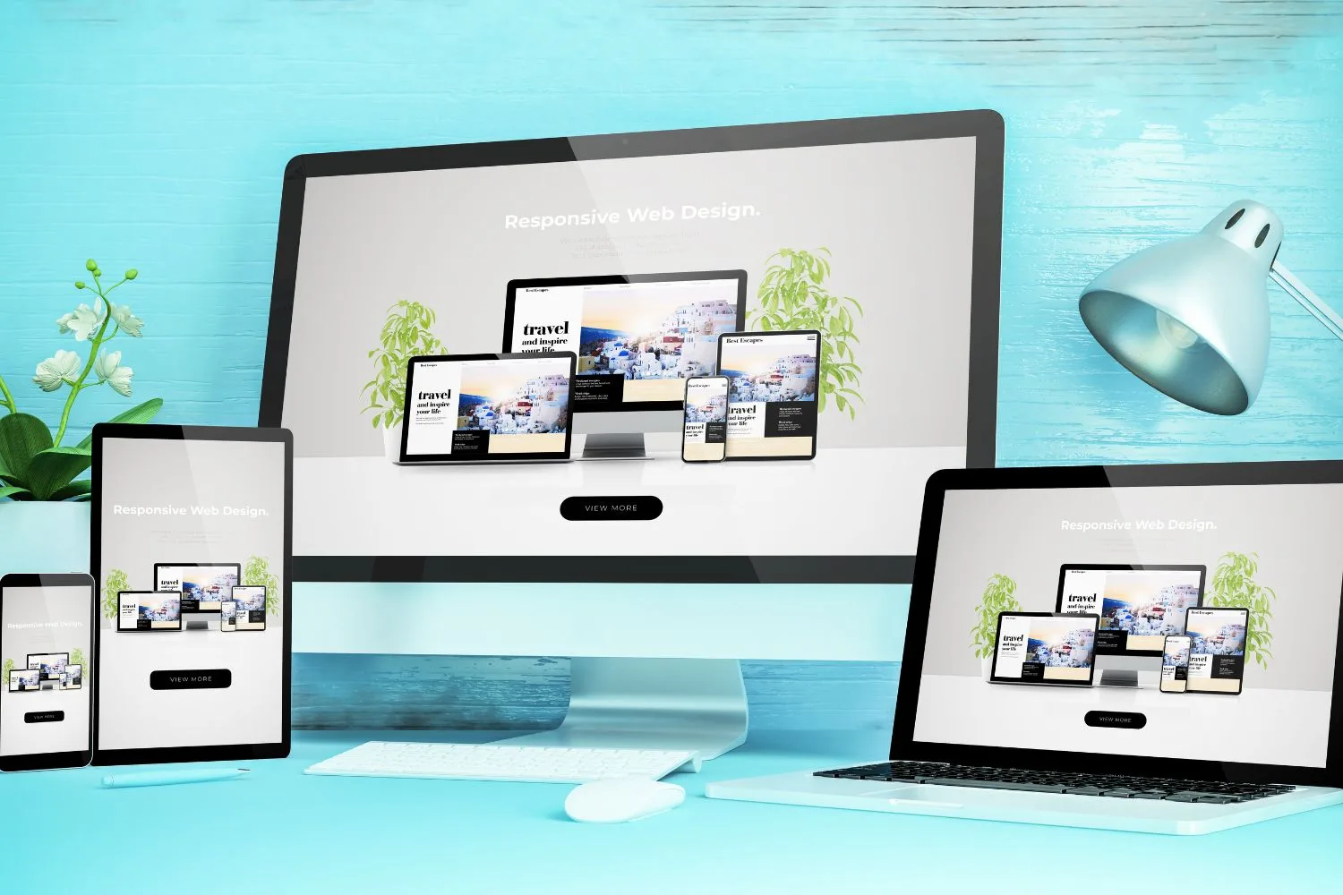
Responsive web design is a design approach that allows a website to adapt its layout and content to different screen sizes and device types. With responsive web design, the website’s layout and content will automatically adjust based on the device’s screen size, providing users with an optimal viewing experience.
Responsive web design is built on several core principles, including:
- Fluid Grids: A fluid grid system is used to create a flexible layout that can adapt to any screen size. This means that elements on the page will resize proportionally based on the screen size.
- Flexible Images: Images are also made flexible by using CSS media queries, allowing them to scale up or down based on the screen size.
- Media Queries: Media queries are used to specify different CSS rules based on the device’s screen size, allowing the website to adjust its layout and content based on the device type.
By using these principles, responsive web design creates a website that is optimised for all devices, including desktops, laptops, tablets, and smartphones. This means that users will have a seamless experience regardless of the device they are using.
Some key features of a responsive website include:
- Scalable Images: Images on a responsive website will adjust in size based on the screen size, ensuring that they always display correctly.
- Consistent Navigation: The website’s navigation will be consistent across all devices, allowing users to easily access all parts of the website.
- Easy to Use: Responsive websites are designed to be easy to use, with clear and concise content that is easy to read and navigate.
Fast Loading: Responsive websites are optimised for fast loading speeds, ensuring that users can quickly access the website’s content on any device.
Examples of responsive web design can be seen across a range of websites, including e-commerce sites, news websites, and social media platforms. For example, Amazon’s website uses responsive design to ensure that the site’s content and layout are optimised for all devices, while The New York Times uses responsive design to provide readers with a seamless reading experience across all devices.
Responsive web design is a design approach that allows websites to adapt to different screen sizes and device types. By using fluid grids, flexible images, and media queries, responsive design creates a website that is optimised for all devices, providing users with a seamless experience across all platforms.
Creating an Accessible Website
In addition to responsive web design, creating an accessible website is also essential for ensuring that all users can access your content, regardless of their abilities or disabilities. An accessible website is designed to be easily navigable and usable by people with disabilities, including those with visual, auditory, and motor impairments.
Some techniques for optimising website accessibility include:
- Use Alt Text: Alt text describes images on a website for users who cannot see them. By using descriptive alt text, users with visual impairments can still understand the content of the image.
- Provide Captions and Transcripts: Providing captions and transcripts for videos and audio content ensures that users with hearing impairments can still access the content.
- Ensure Keyboard Navigation: Keyboard navigation allows users with motor impairments to navigate a website using only their keyboard, without needing to use a mouse.
- Choose Colours Carefully: High-contrast colours and colour combinations make it easier for users with visual impairments to read the content on a website.
- Use Clear Language: Clear and concise language makes it easier for all users, including those with cognitive impairments, to understand the content on a website.
By implementing these techniques, website owners can create an accessible website that caters to all users, regardless of their abilities or disabilities.
Creating an accessible website is especially important for users with disabilities, who may have difficulty accessing the content on a website if it’s not designed with accessibility in mind. By ensuring that your website is accessible, you can help make the internet a more inclusive space for all users.
Some benefits of creating an accessible website include:
- Improved User Experience: An accessible website provides all users with an optimal user experience, regardless of their abilities or disabilities.
- Compliance with Regulations: In many countries, including the US and the UK, some laws require websites to be accessible. By creating an accessible website, you can ensure that you’re compliant with these regulations.
- Increased Traffic: An accessible website is more likely to attract users who have disabilities, which can help increase traffic to your website.
- Improved SEO: Accessibility is a factor that search engines take into account when ranking websites. By creating an accessible website, you can improve your website’s search engine ranking.
In conclusion, creating an accessible website is an essential part of web design, ensuring that all users, including those with disabilities, can access your content. By implementing techniques such as alt text, captions and transcripts, and clear language, you can create an accessible website that caters to all users. An accessible website not only provides an optimal user experience but also ensures compliance with regulations, increased traffic, and improved SEO.
Benefits of Using Responsive Web Design
Responsive web design offers several benefits for website owners and users alike. By designing your website with responsive web design principles, you can ensure that your website is accessible and user-friendly across all devices, regardless of screen size or orientation.
In conclusion, using responsive web design principles can provide several benefits for website owners, including improved user experience, increased mobile traffic, cost-effectiveness, easy management, improved SEO, and futureproofing. By designing your website with responsive web design principles, you can ensure that your website is accessible and user-friendly across all devices, regardless of screen size or orientation.
Best Practices for Using Responsive Web Design
Using responsive web design to create an accessible website for all devices is a crucial step in improving the user experience and increasing traffic. However, it’s essential to follow best practices to ensure that your website is optimised for all devices and is accessible to everyone. Here are some best practices for using responsive web design:
In conclusion, using best practices for responsive web design is essential for creating an accessible website for all devices. By following a mobile-first approach, prioritising content, using flexible layouts, optimising images and media, testing on different devices, implementing accessibility features, and using responsive frameworks and templates, you can ensure that your website is accessible and user-friendly across all devices.
Partner with us to make the web accessible for all!
At JezNorthWeb, we’re committed to creating accessible and user-friendly websites using responsive web design. If you’re ready to improve your website’s user experience and increase traffic, then let us help you on your journey to a better web! Contact us today to schedule a consultation and learn more about how we can help you create an accessible website for all devices. Together, we can make the web a more inclusive and welcoming place for all users.