Colour isn’t decoration. It’s the first thing a visitor perceives, the fastest signal your brand sends, and one of the most powerful levers in your conversion toolkit. In 2026, the palette choices shaping the web are more deliberate than ever, pulled in two directions at once: a hunger for calm and clarity on one side, and an appetite for bold, saturated energy on the other. Here’s what’s driving both.
Why Colour Trends Matter More Than Ever in 2026
Research consistently shows that people form a subconscious judgement about a product or website within the first 90 seconds of viewing it, and that up to 90 per cent of that initial assessment is based on colour alone. Studies published in management and consumer behaviour research have found that colour influences up to 85 per cent of purchasing decisions and increases brand recognition by as much as 80 per cent. These aren’t soft, aesthetic considerations. They’re measurable commercial outcomes.
In 2026, the stakes around colour have risen further because the digital landscape is more competitive and more saturated than at any previous point. Australian businesses of every size are competing not just with local peers but with the visual quality of global brands, high-production social media content, and AI-generated imagery that sets expectations for what a polished digital presence should look like. In this environment, choosing a colour palette that communicates the right qualities about your brand is a strategic decision that sits alongside your marketing and content investments.
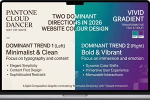
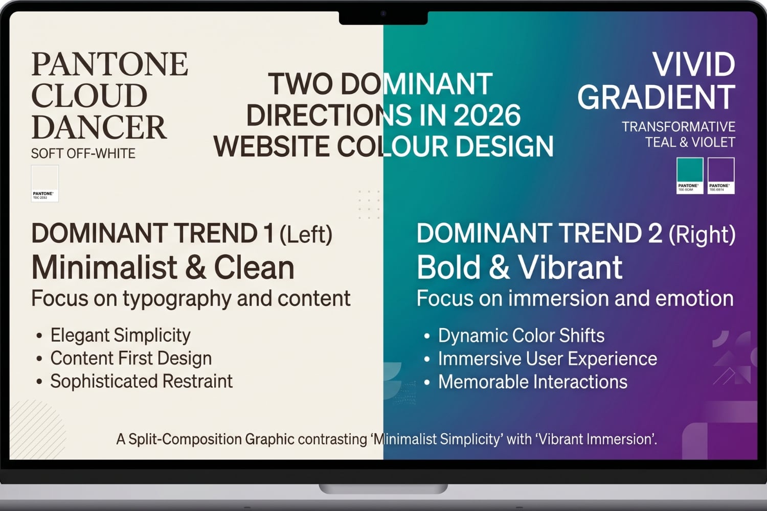
Two distinct cultural forces are shaping web colour choices this year. The first is a broad desire for calm, clarity, and authenticity in reaction to digital overstimulation and rapid technological change. The second is a counter current of expressiveness, nostalgia, and bold visual energy driven by Y2K revival aesthetics, dopamine design, and the visual language of artificial intelligence. Understanding both of these forces, and knowing which applies to your brand, is the foundation of a smart colour strategy for 2026.
| KEY INSIGHT | Colour now functions as a design system, not just a visual choice. In 2026, leading web designers are building colour tokens that adapt across light and dark modes, scale across screen sizes, meet accessibility contrast requirements, and remain consistent from the website through to social media and digital advertising. |
Trend 1: Cloud Dancer and the Age of Considered Neutrals
Pantone named PANTONE 11-4201 Cloud Dancer as its Colour of the Year for 2026, and the choice sparked immediate debate. To some, a soft billowy white felt like a timid selection. To those paying closer attention to what’s driving design decisions across industries, it made perfect sense.
Cloud Dancer isn’t pure white. It carries a subtle warmth that prevents it from feeling clinical or cold, while remaining light enough to function as a flexible foundation for almost any content type. Pantone describes it as offering clarity and the promise of a fresh start and positions it as a conscious response to visual overstimulation. In practical web design terms, it represents the direction that brands under pressure to feel trustworthy, considered, and premium are moving toward.
The broader trend Cloud Dancer signals is away from pure white and pure black as defaults. In 2026, the most thoughtful web colour systems are using tinted neutrals rather than absolute values. Off-white backgrounds in the range of #F0EEE9 to #FAFAFA replace harsh white and reduce screen glare while making photography and typography feel warmer and more intentional. Near-black backgrounds using zinc-tinted values like #09090B replace pure black and feel more deliberate without the void-like quality of absolute black.
For Australian businesses in professional services, healthcare, wellness, luxury retail, and real estate, Cloud Dancer and its family of tinted neutrals offer a powerful palette foundation. When paired with a single considered accent colour and generous white space, this approach produces websites that feel expensive, calm, and easy to trust without requiring elaborate visual production.
| PRACTICAL TIP | If your brand uses pure white (#FFFFFF) as its main background colour, switching to a warm off-white in the Cloud Dancer range is one of the simplest and most impactful improvements you can make to your website in 2026. The change is subtle enough that most visitors won’t consciously notice it, but the perceived quality of the site will lift noticeably. |

Trend 2: Transformative Teal and the Nature-Forward Palette
While Pantone looked toward stillness, WGSN and Coloro chose a very different direction for their 2026 Colour of the Year. Transformative Teal is a deep blue-green that blends aquatic and earthy qualities, positioned around themes of ecological awareness, change, and resilience. WGSN reported a nine per cent year-on-year rise in consumer searches for teal heading into 2026, reflecting a growing appetite for colours that feel connected to the natural world.
In web design terms, Transformative Teal works across a wide range of applications. As a primary brand colour, it carries authority without the coldness of dark navy or the aggression of bright blue. As a secondary accent against neutral backgrounds, it feels considered and modern. As part of a broader nature-inspired palette, it pairs effectively with Cloud Dancer off-whites, sage greens, earthy terracotta, and warm ochre.
The teal trend fits into a wider movement toward what designers are calling eco-digital aesthetics, where the visual language of sustainability and the natural world is applied to digital products and services. For Australian businesses with a genuine sustainability focus, or those in sectors where connection to nature is part of the brand story such as agriculture, tourism, health, and environmental services, this palette family is both on-trend and strategically coherent.
Importantly, teal also pairs well with the other dominant palette of 2026. A Cloud Dancer foundation with Transformative Teal as the primary accent creates a combination that’s simultaneously calm and energetic, minimal and purposeful. This pairing appears across interiors, fashion, and digital design throughout the year and represents one of the most versatile and broadly applicable colour combinations available to web designers right now.
| FOR AUSTRALIAN BRANDS | Transformative Teal resonates strongly with Australian audiences because it evokes the country’s natural landscape, from the coastal waters of the Great Barrier Reef to the deep eucalypt greens of the Blue Mountains. For brands with a genuine connection to Australian nature, sustainability, or outdoor lifestyle, this colour family carries authentic meaning that reinforces rather than simply follows a trend. |
Trend 3: Bold Accents, Neons, and the Dopamine Design Movement
Running alongside the quiet luxury of Cloud Dancer and teal is a louder, more expressive current in 2026 web design. Dopamine design, named for the neurological response triggered by bright, stimulating colour, is a direct reaction to years of safe, muted corporate palettes. It’s bold, unapologetic, and joyful, and it’s showing up across everything from SaaS landing pages to food and lifestyle brands.
Neon accents on dark backgrounds
One of the most striking applications of the dopamine design movement is the combination of vivid neon accent colours against deep dark backgrounds. Electric blues, vivid purples, lime greens, and hot corals glowing against charcoal or near-black create high-contrast visual experiences that feel immersive, high-tech, and energetic. This aesthetic draws on gaming, AR and VR interfaces, and cyberpunk visual culture, and it’s becoming increasingly mainstream for technology and innovation brands.
The practical application isn’t to make the entire website neon. The trend works because of contrast, not uniformity. A near-black background with a single electric accent colour used on call-to-action buttons, hover states, and key interactive elements creates impact without overwhelming the visitor. Research from the Nielsen Norman Group supports the effectiveness of this approach, confirming that high-contrast colour combinations improve readability and user engagement when applied with intention.
Sunny yellow and retro earth tones
Bright, saturated yellow is having a significant moment in 2026, fuelled by 70s and 80s nostalgia and the broader retro revival that has been building through recent years. Sunflower yellows, burnt sienna, faded teal, and dusty coral appear across creative portfolios, artisan brands, food and hospitality websites, and fashion labels. These colours trigger an emotional connection that purely digital-native palettes can’t replicate, and they give brands a distinctive visual identity that stands out against more conservative competitors.
Retro palettes work best when they’re treated as a personality statement rather than a complete colour system. Pairing a vintage burnt orange or dusty coral accent with a neutral background and considered typography produces a result that feels both distinctive and polished, rather than chaotic or dated.
| DESIGN PRINCIPLE | The rule that prevents dopamine design from becoming visual noise is this: when everything is bold, nothing stands out. The most effective use of saturated accent colours in 2026 is strategic placement against calm, neutral foundations. The contrast is the tool. Uniformly bright palettes eliminate the effect entirely. |

Trend 4: Iridescence, Gradients, and AI-Influenced Palettes
Artificial intelligence is influencing web colour in 2026 in a way that goes beyond the tools used to generate imagery. The visual language of AI products, characterised by iridescent surfaces, metallic sheens, and colour relationships that feel computational rather than traditionally harmonious, is filtering into mainstream web design and creating a new aesthetic category of its own.
Gradients have been cycling in and out of web design fashion for years, but in 2026 they’re more sophisticated and more structurally integrated than before. Rather than being applied as decorative hero section backgrounds, gradients in 2026 function as brand systems. A violet-to-cyan gradient as a primary brand identity element, used consistently across CTAs, hover states, and key marketing moments, creates a more cohesive and memorable visual experience than scattered gradient applications.
The most referenced gradient combinations for technology and innovation brands in 2026 lean toward violet-to-cyan combinations that communicate innovation and premium quality without feeling clichéd. For fintech and business technology products, emerald-to-teal gradients convey growth and stability with a contemporary feel. Iridescent, holographic effects that shift across blues, purples, and greens appear particularly in brand identity elements for AI product launches and creative technology companies.
If you’re considering how gradient design might work for your brand, our web design services page covers how we approach colour systems as part of our full website design process.
| TECHNICAL NOTE | Mesh gradients and ambient lighting effects, where colour appears to radiate from a soft, non-geometric source, are one of the most refined gradient applications in 2026. They add depth and warmth to otherwise flat backgrounds without the harsh banding of older linear gradients, and they render beautifully on modern OLED screens which display a wider colour gamut than traditional LCD displays. |
Trend 5: Dark Mode as a Deliberate Creative Choice
Dark mode has moved well beyond its origins as an accessibility and battery-saving feature for mobile users. In 2026, dark mode is a design statement, with a growing number of brands building their primary website experience around a dark palette rather than treating it as a secondary option toggled by system preferences.
The key shift in how dark mode is approached in 2026 is the evolution from inverted light themes to purpose-designed dark palettes. A truly well-designed dark website doesn’t simply swap white and black. It uses carefully chosen dark backgrounds with enough warmth or coolness to feel intentional, pairs them with typography that’s slightly off-white rather than pure white to reduce contrast fatigue, and selects accent colours that perform correctly in the dark environment without the washed-out appearance that colours designed for light backgrounds often produce when placed on dark surfaces.
For Australian businesses in creative industries, technology, entertainment, and premium lifestyle sectors, a well-executed dark mode website can project a level of sophistication and confidence that lighter alternatives find harder to achieve. The challenge is execution. A dark website done poorly feels heavy, difficult to read, and visually oppressive. Done well, it’s among the most striking and memorable presentations available in modern web design.
From an accessibility perspective, dark mode also offers genuine benefits for users with certain visual sensitivities, and the growing expectation from users that websites respect system-level dark mode preferences means that building colour systems that work in both environments is increasingly standard practice for professional web design.
Trend 6: Muted Pastels and the Sophisticated Softness Movement
Pastels have been present in web design for years, but in 2026 the pastels that are resonating aren’t the bright, candy-coloured versions of earlier trends. The version gaining traction this year is muted, sophisticated, and deliberately understated. Dusty pinks, sage greens, powder blues, and soft lavenders, each desaturated just enough to feel grown-up rather than juvenile, are appearing across a wide range of digital products.
This aesthetic sits at an interesting intersection of the broader trends active in 2026. It shares the calm and clarity impulse of Cloud Dancer without committing fully to the near-white end of the spectrum. It provides colour and personality without the intensity of neon or the commitment of a bold primary palette. For startups, creative service businesses, health and wellness brands, educational platforms, and lifestyle websites, muted pastels offer a palette that is friendly without being childlike, and distinctive without being aggressive.
The practical application of muted pastels in 2026 web design typically involves a single dominant pastel as a primary background or hero section colour, paired with a complementary muted tone for secondary elements, dark text for legibility, and restrained use of a deeper accent for interactive elements. The risk to avoid is excessive use across all sections, which can make a site feel monotonous and lacking in visual hierarchy.
| COLOUR PSYCHOLOGY | Muted pastels carry strong psychological associations with safety, approachability, and care. This makes them particularly effective for brands in the health, education, and community services sectors, where the emotional register of the design needs to make visitors feel welcomed and reassured rather than impressed or stimulated. |
Colour and Accessibility: The Non-Negotiable 2026 Standard
No colour trend in 2026 is worth pursuing if it compromises the accessibility of your website. The Web Content Accessibility Guidelines (WCAG) require a minimum contrast ratio of 4.5 to 1 between body text and background colours, and 3 to 1 for large text and user interface components. These requirements aren’t optional considerations for Australian websites. The Disability Discrimination Act 1992 and the associated technical standards effectively require that digital content served by Australian businesses be accessible to people with visual impairments.
Several of the trends active in 2026 require particular care from an accessibility standpoint. Muted pastels can fail contrast requirements when paired with light text. Neon accents on very dark backgrounds can create glare and discomfort for users with photosensitivity. Gradient backgrounds make consistent contrast measurement more complex because the background colour changes across the element. Each of these is solvable with careful colour selection and testing, but the solution must be built into the design process from the start, not retrofitted after launch.
Accessibility-first colour design in 2026 also goes beyond contrast ratios. Colour should never be the only way information is communicated, because colourblind users won’t receive that information. Form errors, success states, warning messages, and navigation indicators all need non-colour reinforcement such as icons, patterns, or text labels. Building these considerations into a colour system from the beginning produces websites that perform better for all users, not just those with accessibility needs.
For more on how we approach accessible colour design as part of our web projects, visit our website design approach page where we explain how we integrate accessibility standards into every project from the brief stage.
| AUSTRALIAN REQUIREMENT | Businesses operating in Australia have obligations under the Disability Discrimination Act 1992 in relation to digital accessibility. Inaccessible web colour choices that exclude users with visual impairments can expose your business to legal risk, and more importantly, they result in a worse experience for a significant portion of your potential customers. |
Choosing the Right 2026 Colour Direction for Your Brand
The diversity of colour trends active in 2026 is itself an insight. There’s no single correct palette direction for the year. The right choice depends entirely on who your audience is, what emotional register your brand occupies, what industry you operate in, and what you want visitors to feel and do when they arrive at your website.
For brands in professional services, finance, legal, and healthcare, the Cloud Dancer and tinted neutral direction combined with a single authoritative accent in teal, deep navy, or considered green offers credibility, calm, and trust. For technology, software, and innovation brands, the gradient and dark mode directions communicate ambition, capability, and premium positioning. For hospitality, food, lifestyle, and creative services, the earth tone, terracotta, and retro palette family creates warmth, distinctiveness, and personality. For brands targeting younger audiences or those in entertainment and culture, dopamine-inspired accents and bold saturated pairings deliver the energy and expressiveness those audiences respond to.
What’s consistent across all these directions in 2026 is the expectation that colour choices are made intentionally, implemented as a system rather than applied ad hoc, and tested for accessibility and performance before launch. The gap between websites that approach colour strategically and those that treat it as an afterthought has never been wider, and the commercial consequences of that gap are measurable in engagement, trust, and conversion rates.
The table below provides a practical summary of the major 2026 colour directions covered in this guide, with hex references and recommended application contexts.
| Colour / Palette | Hex Reference | Mood | Best Used For |
| Cloud Dancer (Pantone 2026) | #F0EEE9 (approx.) | Calm, clarity, reset | Neutral backgrounds, white space, luxury and wellness brands. |
| Transformative Teal (WGSN) | #2A8C88 (approx.) | Growth, resilience, nature | Tech, sustainability, health, and purpose-driven brands. |
| Mocha Mousse (Pantone 2025) | #A47864 | Warmth, sophistication | Hospitality, food, lifestyle, premium consumer brands. |
| Neon accents on dark | #CCFF00 on #111111 | Energetic, high-tech | Gaming, SaaS, fintech, and innovation-focused launches. |
| Iridescent / AI gradients | Violet to cyan blend | Futuristic, premium | Technology, AI products, software, and launch pages. |
| Muted pastels | Dusty pinks, sage | Friendly, polished | Startups, creative portfolios, lifestyle, and education. |
| Retro earth tones | Terracotta, sienna | Nostalgic, distinctive | Artisan brands, food, fashion, and creative agencies. |
| Tinted neutrals (warm or cool) | #09090B near-black | Considered, modern | Corporate, finance, legal, and data-heavy products. |
Putting It All Together: A 2026 Colour Checklist for Your Website
Before making any colour decisions for a new or refreshed website in 2026, working through the following questions will help ensure the result is strategic, accessible, and fit for purpose.
- Does your primary background use a tinted neutral rather than pure white, and is it warm or cool depending on your brand personality and industry?
- Have you defined a single primary accent colour that works as a system across CTAs, links, hover states, and key interactive elements rather than using multiple competing accent colours?
- Does your colour palette meet WCAG 2.1 AA contrast requirements for all text and interface components, and has this been tested with an accessibility checking tool rather than assessed by eye?
- Have you considered how your palette performs in both light and dark mode, even if you’re not building an explicit dark mode, because many users browse with system-level dark mode enabled?
- Is your gradient usage intentional and brand-systematic, with gradients assigned to specific roles rather than applied decoratively wherever they seem to fit?
- Do your colours carry appropriate psychological and cultural weight for your specific audience and industry, or have you chosen them primarily because they appear on a trend list?
- If you’re using bold accent colours or neons, are they deployed as strategic contrast elements against calm foundations, or are they competing across the entire page?
- Does your colour palette include non-colour reinforcement for all information-carrying elements such as errors, success states, and navigation indicators?
| THINKING ABOUT REFRESHING YOUR WEBSITE COLOURS? The team at Jez North Web helps Australian businesses build websites with colour systems that are on-trend, accessible, and built to convert. Whether you need a full redesign or a targeted colour refresh, we can help. Start the conversation at jeznorthweb.com.au/contact |